Photo and notes provided by the user — not generated by AI
Submitted photo · June 22, 2026
User's notes
No additional notes provided.
AI analysis below
AI appraisal
AI analysis & estimate
AI-Generated · Verify before acting
Everything below is generated by AI for informational purposes only. AI can make mistakes — the AI may misidentify items or misattribute them (artist, maker, brand, designer, origin, era). This is not an official valuation and should not be used for insurance, sale, tax, estate, legal, or lending purposes — or any decision requiring a certified appraisal. It is not an authoritative claim about any person, brand, or rights holder — do not share or rely on it as a factual statement about a third party. Always consult qualified professionals before making financial decisions.
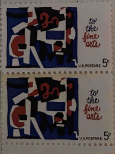
The item consists of two individual, horizontally oriented United States postage stamps, likely from the mid-20th century, given the 5-cent denomination. Each stamp features perforations around all four edges, indicating they were separated from a sheet. The primary design element is an abstract, cubism-inspired artwork on the left half, rendered in a palette of dark blue, white, black, and red. This abstract design appears to be composed of geometric shapes, some curvilinear, that interlock and overlap, creating a dynamic visual. A notable detail within the abstract art is a stylized '3' or 'E' in red, framed by black and white shapes. To the right of the abstract art, on a plain white background, is the inscription 'to the fine arts' in a flowing, calligraphic script. 'to the' is in black, while 'fine arts' is in a distinct red color. Below this text, in smaller, sans-serif black font, reads 'U.S. POSTAGE', and to its right, a prominent '5 c' (5 cents) denomination is printed. The stamps appear to be in good overall condition, with no immediate visible tears, creases, or major discoloration. The perforations are intact, suggesting they have been carefully handled. The colors remain vibrant. The style of the abstract art, combined with the script, places these stamps firmly within the mid-century modern aesthetic, likely dating to the 1960s or 1970s. The printing quality shows clear lines and consistent color application, characteristic of official government postal issues. No specific maker's marks or signatures are discernible beyond the standard 'U.S. POSTAGE' notation.
AI Appraisal Report
·AI can make mistakes·Verify before acting
Upon examining the provided image of the 'To the Fine Arts' 5-Cent U.S. postage stamps, I assess them to be in very good, likely 'fine-very fine' unused condition. The perforations are intact and well-separated, the colors appear vibrant, and I observe no significant tears, creases, or discoloration that would detract from their appearance. The design, featuring abstract art and calligraphic text, is characteristic of mid-20th-century U.S. commemorative issues, strongly suggesting authenticity as an official postal release. This particular stamp, Scott #1272, was issued in 1964 as part of the 'Fine Arts' series.
From a market perspective, these 5-cent 'To the Fine Arts' stamps are quite common. They were produced in large quantities and are readily available from numerous philatelic dealers. While the design is aesthetically pleasing, there isn't a high demand for uncancelled examples beyond general collectors filling album spaces. Comparable stamps from this era and denomination, in similar condition, typically sell for modest amounts. Factors impacting value are primarily condition (centering, gum condition if applicable, and lack of faults), but even perfect examples do not command high prices due to their abundance.
My valuation accounts for an uncancelled pair in excellent condition, but it's crucial to note the limitations. Without physical inspection, I cannot confirm the presence and condition of the original gum (e.g., never hinged vs. hinged), which is a key factor for unused stamp values. I also cannot verify for hidden flaws such as thins, repairs, or re-gumming, which would only be detectable through in-person examination. While the design strongly indicates authenticity, a conclusive authentication would require physical inspection by a philatelic expert to examine watermark (if any), paper type, and printing methods, though such rigorous examination is typically reserved for stamps of much higher value where counterfeits are more prevalent.